Welcome back to the blog!
(And as you will notice, now with a few adverts here and there.)
On the 28th February 2013, the government announced the national day celebration ceremony under the theme of “Enn Pei, Enn Nasion, Enn Destin” on their Rs 50 million worth web site and also, published the official logo for this special day. Selected from 95 entries participating in the competition, the person who submitted this logo will be officially awarded Rs 100,000 on this same day.
The Rs100,000 worth logo

According to the gov web site, the description goes as follows:
The logo shows four hands which are linked by the colours of the Mauritian flag and altogether they represent a dove.
The competition
Launched on the 23 January 2013, some of the specifications/conditions for the competition were as follows:
- Format – Vector format and high definition jpeg.
- Colour – Maximum four flat colours or quadrichromy (full colour).
- The Logo must also be submitted in colour A4 size along with a reduced black and white version of 3 x 3 cm.
- […]
- Each entry shall be an original work and free from any copyright.
- […]
- A brief on the logo explaining the various features and their significances must also be submitted.
*cough* *cough*
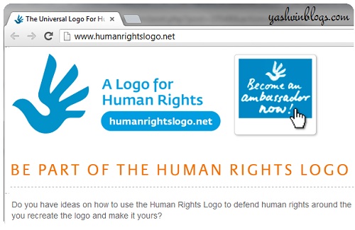
Strangely, a blog visitor mailed me the following link to the Human Rights Logo web site (screenshot below):

Do it yourself logo
(Graphics sent to me by the same person who mailed me)

Comments?
Without naming any person or accusing anyone of plagiarism, I definitely prefer striking original logos to the ones that have been “inspired” from other existing logos. This makes me remember a very similar post I wrote about another “Mauritian” logo. On top of that, the official logo for the 12th March does in no way looks like a “hand” or four hands as described by the government. The bird (or whatever) as presented, looks more like the one in the Phoenix Beer logo. And since when did the dove gain importance in the Mauritian history? As far as I know (correct me if I’m wrong), the white dove and the olive branch is used as a symbol of peace. But a large red dove on its own? And why does the red color occupy 50% of the logo while the other 3 colors make up the rest of the design? Just my personal point of view of course!
Your comments? And perhaps, anyone with good background in design and logos can help to assess this one? (Please note that defamatory or similar comments which can land me into trouble will not be approved.)
Bon weekend to all!!!

wasting my tax money on graffiti 😛
instead we should care about the poor Mauritians
and treat them with a nice meal on the day of the independence
LikeLike
millions and millions on useless activities!!!
LikeLike
I lost hope when I saw the proposed logos for “Made in Mauritius” last year, so nothing surprises me anymore.
On a side note, welcome to the Adsensers of Mauritius 🙂
LikeLike
Correction: Made in Moris
LikeLike
Thank you!
LikeLike
Dimoune pena manzer dans pays la.. aster pe depense tou kaliT cash lor fete national.. gaspiyaz largent!! SHAME ON NAVIN AND HIS USELESS MINISTERS~
LikeLike
On that “logo” the colour red dominates all the other ones.
And by the way, why not a new logo for each day of the year?
LikeLike
Some Mauritian “designers” will run out of logos 😛
LikeLike
It’s not anything new to us that lots of money are being spent on ‘useless’ activities! It’s definitely in the culture around here, get used to it because nothing’s going to change!
LikeLike
I was part of the competition and the logos I have proposed can be found at:
https://www.yousendit.com/download/UW14anZzNDI5bEJ4Tk1UQw
Well, mes felicitation to Mr Chitanand Luximon who is the winner of this year – 2013. This guy is a connoisseur in art of logo making, for this he also won the 2nd prize for a BANK NOTE Competition organized by the Bank of Mauritius in 2007. See link
Click to access Results_Banknote_design_competition.pdf
Therefore, Mr. Chitanand, I am sure that budding graphic designers of Mauritius would be very please to know how you won such competitions and certainly share some tips of logo making with us. This will enable us to reach new heights.
As the new branding of Mauritius rightly says “Maurice C’est Un Plaisir”
Oumar
LikeLike
Congrats on my behalf too.
One must be proud to see his own-made logo published everywhere :{
LikeLike
wow! 2nd AND 4th prize (cash prize actually exceeding the one of the winner lol)
I like your propositions, a personal preference for the first and last ones where u can feel the festive side, and i can easily see how it could be translate on collaterals
LikeLike
This is what the GUYS that governs the country keeps telling, EGALITER, JUSTICE etc. Complete bullshit, you bastards, the population should rip you off – I know this won’t happen as large section of the population are ‘roder boute’ and have ‘mentaliter bater bis’!
LikeLike
45th anniversary = Rs100 000. Just wait for the price of the one they will be doing for the 50th. Remember 50 million rupees for a mockup governement portal?
LikeLike
i actually like this logo..bt it luks the same as the Human rights 1.. mayb the money shud go to them 😛 && i did c the hands n the dove..bt whether it is meaningful?? im nt sure
LikeLike
this logo is BULLSHIT
LikeLike
Moi mo trouve li ressembler la bierre phoenix
LikeLike
http://www.islandcrisis.net/airbus-a380-landing-mauritius-march-2013/
The logo was under the emirates a380. Wonder how much they paid for the logo to be sticked under this plane
LikeLike
If ever they paid something, it will definitely be more beneficial than running that air mauritius thing will all their petits copains and their “service”.
LikeLike
shame 😐
LikeLike